
A fresh coat of paint seems like one of the simplest ways to transform a home. It’s relatively inexpensive, straightforward to apply, and can completely change how a space feels. Yet choosing the wrong color might do more harm than good, potentially reducing your property’s appeal and market value by thousands.

Why Paint Color Matters More Than You Think
The colors on your walls do far more than provide a backdrop. They influence how spacious a room appears, the atmosphere it creates, and critically, whether prospective buyers can envision themselves making it their own.
Jessie Brooks, who manages products at Davincified, a company specializing in custom paint-by-numbers kits, has identified which paint colors enhance a home’s value and which ones detract from it. She warns that some hues look appealing in the tin but prove disappointing once applied to actual walls, sucking vitality from a space rather than enhancing it.
The Color to Steer Clear Of
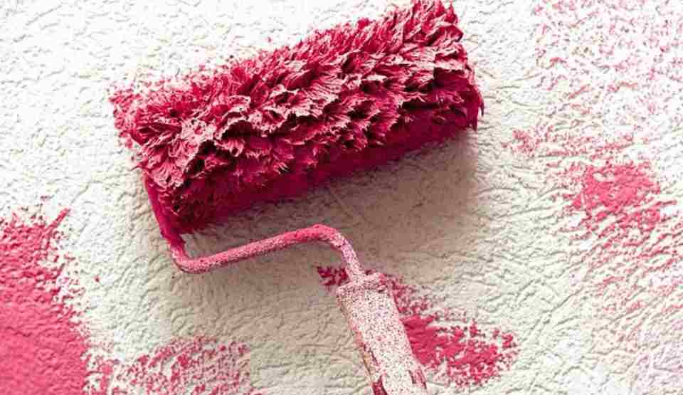
The problematic shade? Pink, specifically certain varieties including murky blush tones and dated bubblegum shades.
While not every pink falls into this category, the specific shades that gained popularity in recent years are beginning to reveal their limitations. Those greyish, subdued blush tones initially appeared refined but quickly become lackluster and lifeless once covering entire walls.
Brooks explains that these murky pinks lack warmth and fail to bounce light effectively around a room, making spaces feel more cramped and dimmer than they actually are. As time passes, they simply look dingy.
Bubblegum pinks create a separate set of problems. While initially bold and cheerful, they become outdated rapidly. What seems whimsical one season appears childish the next, leaving potential buyers struggling to see beyond the color choice.
“Trendy colors have a short shelf life,” Brooks observes. “When you’re repainting every few years just to keep up, you’re wasting time and money.”
The Financial Impact
Real estate professionals consistently note that particular wall colors discourage buyers. Research indicates that an alarming 40 percent of potential buyers would lower their offer if they found the interior color scheme unappealing, and pink frequently tops that list of objectionable colors.

When viewers enter a pink room, they immediately begin mentally calculating redecoration expenses, which directly translates into reduced offers.
“Buyers want to move in without major work,” Brooks states. “If they’re faced with repainting entire rooms before they can settle in, they’ll either walk away or knock money off their offer to cover the hassle.”
Neutral shades allow buyers to picture their own belongings and personal style within the space. Pink imposes a particular aesthetic that most people find difficult to overlook.
The Psychology Behind the Problem
The emotional impact of color isn’t just marketing rhetoric—it genuinely influences how people experience a space. While pink can provide a calming effect in limited amounts, certain shades covering large wall surfaces produce unexpected reactions.
Murky pinks can leave people feeling lethargic or uninspired. They don’t provide the vibrancy of brighter colors or the serenity of genuine neutrals, instead leaving occupants in an awkward middle ground.
“Your walls set the mood for everything else in the room,” Brooks notes. “If the base color feels off, nothing else will look quite right either.”
More vivid pinks might initially seem energizing, but they can become overpowering. Living with walls that constantly demand attention becomes tiring, and the color frequently clashes with furniture, artwork, and even shifting natural light throughout the day.
Better Alternatives
For those who appreciate pink but desire something more enduring, Brooks suggests considering warmer terracotta shades or gentle peachy tones that offer greater depth and sophistication.
“Terracotta has been used in homes for centuries because it’s warm, earthy, and works with almost any style,” she notes. “Rather than competing with your furniture or artwork, it complements them.”
For those preferring lighter options, soft cream shades with warm undertones deliver that gentle, inviting atmosphere without the drawbacks associated with pink. They reflect light beautifully, make rooms appear more spacious, and complement any decorating approach.
Greige (grey-beige combinations) maintain lasting appeal because they’re genuinely neutral. They don’t dictate a specific atmosphere or style, meaning they won’t feel outdated in five years.
“The best wall colours are ones you stop noticing,” Brooks explains. “They should enhance the space and let your furniture, art, and personal touches take centre stage.”
Creating Lasting Appeal
Developing a home that feels contemporary without being overly trendy demands long-term thinking. Brooks recommends selecting wall colors that homeowners can imagine living with for at least ten years.
“Ask yourself if this colour will still feel right when your furniture changes, when trends shift, when you’ve had different artwork up,” she advises. “If the answer’s no, keep looking.”
White maintains its popularity for solid reasons: it’s clean, luminous, and infinitely versatile. However, harsh white can feel sterile, so warmer whites with subtle cream or ivory undertones typically perform better.
Soft greys suit modern homes well, though they require thoughtful selection. Some greys can appear purple or blue depending on lighting conditions, making it essential to test samples in your actual space before committing.
The Bottom Line
Brooks concludes with this perspective: “Homeowners often chase trends without considering the long-term impact on their property. Certain pink shades might feel fresh now, but they age poorly and can genuinely hurt resale value. Buyers want to see a blank canvas they can make their own, and overly specific colours like muddy blush or bubblegum pink make that impossible.”
She emphasizes that timeless doesn’t mean dull. Warm neutrals, soft creams, and earthy shades create welcoming spaces that work with any aesthetic. They allow personality to emerge through furniture and art rather than competing with assertive walls.
When selecting paint, consider whether you’ll still appreciate it in a decade, and whether future buyers will as well. Your walls should be a foundation, not a statement that limits your options or reduces your home’s value.